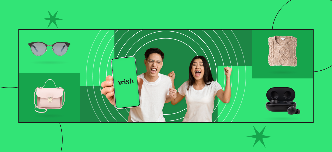
Noticed anything new about us recently? We’ve been dropping hints but this week it’s time to reveal the really big news. Drumroll, please….we’ve refreshed our look! That’s right! For the first time since Wish was founded in 2010, we’re revamping our brand identity. Goodbye, baby blue, and hello, green. Move over old logo style, and make room for a new and expressive redesign. You’ll notice our updated look across most touchpoints, from the app to emails, and of course, swag.
So why the update? There’s a huge transformation effort underway at Wish and that made us think about the best ways to communicate our evolution to the entire world. Within the past year there have been significant enhancements made, including updated merchant standards, new product features like Wish Clips, and faster delivery.
The new branding is bolder, modern, and playful. Why? Because we needed something that helps communicate our uniqueness and signals our company’s next phase of growth.
The new Wish mission statement
As part of our refresh, we are excited to share our new mission statement: Bargains Made Fun, Discovery Made Easy. We believe this better reflects our continuous focus of delighting you with amazing product listings, while making sure your time exploring on the app is fun and easy.
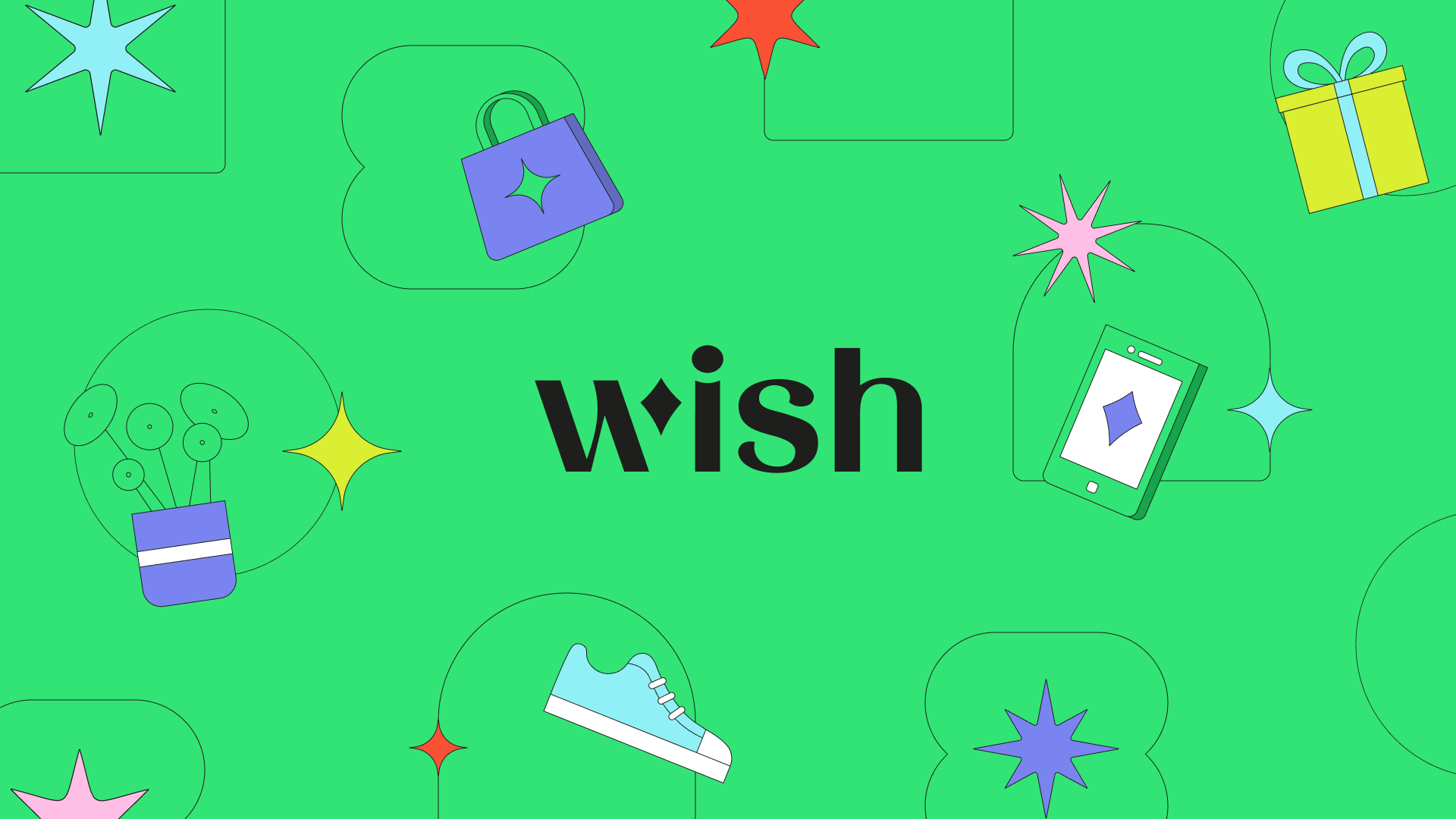
The new Wish logo
Wish has come a long way from its humble beginnings as a small San Francisco-based startup to a global discovery-based shopping experience available in over 60 countries. When the company launched, the original logo known by millions was kept simple with a classic san serif font and exaggerated extension of the “w.” The revamped logo has been crafted to be versatile and reflects a more memorable visual identity. It’s a metaphor for our ignited imagination and endless possibilities. Most notably, the “w” part of the new logo includes a unique “flair” that can be adapted to highlight cultural moments, special occasions, and promotions. Learn more about our new logo here.

The new Wish color palette
The Wish blue was nice, but no longer reflective of the intentionally surprising discovery and wonder that awaits you in the app. Wish is anything but ordinary and our new core colors were chosen to reflect our brand promise of being a go-to destination to explore curiosities and enjoy the shopping hunt. The new palette is bursting with energetic vibes, with bold color compositions that add dimension.
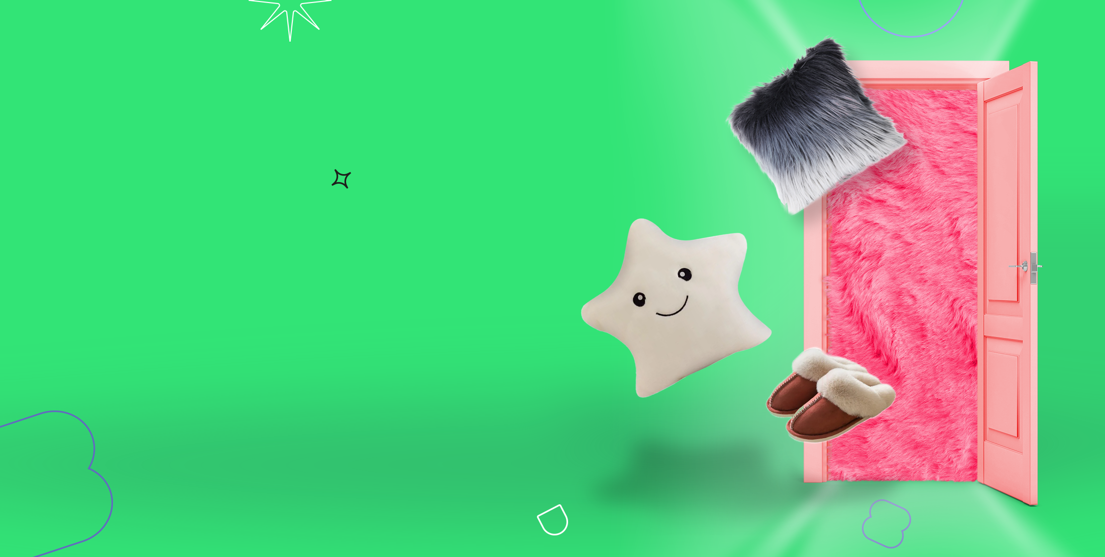
The new Wish visual style
Expect to see our exciting new visual identity brought to life through whimsical and eye-catching graphic elements such as decorative flairs, unique frames, various object perspectives, and dynamic illustrations that emphasize discovery and play.

The new Wish voice
While we’re updating our look, we’re also honing in on the voice of the brand and how we communicate with you, our loyal customers. We want to make sure that our conversation with you is energetic, engaging, and friendly. You may even see an emoji or two 😁! We’ve got a playful personality and we’ll look for ways for that to shine through when we talk with you. Our brand voice is a part of the Wish rebrand core values — intentionally surprising, valuable and trustworthy, fun, and entertaining.
What’s next?
There you have it! The story behind where we were with our branding, where we are, and where we’re heading. To celebrate our refresh, a new campaign is rolling out the rebranding in our largest markets encouraging viewers to download the app and take part in Wish’s discovery shopping experience. Check out the immersive video and learn more about it here.
The new brand identity is just the start of many exciting things to come. To stay updated on our progress, check out our Inside Wish series.
Interested in being part of our evolution? We are hiring! Check out open positions here.